Category Archives: Church

Comics for Camp: Completed!

As mentioned a few months ago, my ongoing illustration work with Pine Cove Christian Camps yielded some cool fruit this year: the opportunity to do comic pages. Here are the finished single-page stories I did for their Base Camps Bible Studies. (You can see the rough drafts here— most of which are pretty different from the final versions!)


1 Comment

Filed under Cartoons, Church, Comics, Divinity

Month in Review: May

May is apparently the time when we change gears at the church. Major events wind down as families plan for vacations and summer sports, which requires less design and communication from my department. That means my responsibilities have shifted more toward short-form video production– which I intend to post more about soon– and away from pure graphics work.

Still, here’re a few bits and pieces from the past month that I’ve had a hand in:

Shirt design for our volunteer thank-you party.

A mockup of the same.

Artwork for one of the more popular (and messy!) events our children’s ministry puts on.

Preliminary art for a camp t-shirt.

And once again, the Interfaith Directory ad from earlier this month!

Leave a comment

Filed under Church, General Musings, Graphic Design

And So I Join the Instagram Copyists

I got into the graphics game by learning to create images– not by manipulating them. It’s anachronistic of me– most of our modern marketing and advertising, et al, is dependent on photography and the adjustment thereof. So I’m wading into those waters slowly.

Chris Spooner helped. He’s a designer I came across who offers some very savvy tutorials, one of which concerned how to make your photos look like they were fished out of an old Polaroid camera (or for short, “Instagram”).

So in the past few weeks, whenever I’ve had to do photo-oriented designs, I’ve relied heavily on Chris’s advice. I may be behind the times on the retro-analog craze, but I’ll be darned if I don’t wear myself out catching up!

Evidence below.

Ad for The Woodlands Interfaith 2012 directory. Photography by Jordan Bradley; top banner by Vince Mims.

Rack card for a school supply drive; photo courtesy of Tia Plum.

Leave a comment

Filed under Church, General Musings, Graphic Design

Month in Review: April

Well this was a busy season!

Between Easter, planning a volunteer thank-you party, and prepping to break ground on new buildings, things were hopping at StoneBridge last month. Some highlights from the rush:

Image

Pamphlet cover for our Good Friday program. Since it was outdoors, we sought to give it a rustic, old-timey feel.

Image

First-time visitors get a coupon to our in-house cafe. Here’s our latest (for Easter!) with background courtesy of David Wittenmyer

Image

The final version of our volunteer thank-you party’s Save the Date. 

Image

…and the final version of the Beach Party invite itself. (You can see the black-and-white draft here).

Baptism slide. Background images via otjep on Stock.XCHNG.

Image

And finally, the logo for our new sermon series. (You can see the concepts for it here).

One last thing of note: while we worked to develop the Soak Up the Son material, my pastor ran across some art he really liked from a company called Stampendous. We reached out to them and they actually donated their orignal art (the umbrella and tree) for the series. If you’re in the market for crafty stuff, hit them up– we owe them some big-time thanks.

Leave a comment

Filed under Cartoons, Church, Graphic Design

A Logo For The Disc Golfers

People in The Woodlands have a passion for disc golfing. It’s unreal. I myself don’t excel at it, but it’s amazing to see how many dudes here go out and bond over hurling plastic circles into the woods. It’s like a civilized, conversation-oriented version of the discus. Or a less-sweaty Ultimate Frisbee.

So naturally, our church has a disc golf course.

Image

Logo idea for our disc golf course, done on my tablet with Adobe Ideas

Image

Completed logo: combination of line drawing and Photoshop

The logo idea was my boss’s; the execution is mine. But our real brainchild is David Wittenmyer, who both built the course and designed the website for it. Go admire his handiwork.

Leave a comment

Filed under Church, Graphic Design, Sketchbook

Causing An Effect

One last thing about Christmas at our church:

We had to build a little town of Bethlehem.

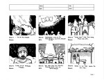
Plans for a full-scale Bethlehem mockup

That’s right. The senior staff decided to build a Styrofoam replica of Bethlehem in the middle of our church lobby. It wasn’t just meant to be an exercise in nativities. Besides just looking cool– and tying into our “Bethlehem Effect” holiday logo– it was also meant to be a display for our holiday giving campaign, which we cleverly dubbed “Cause An Effect.”

“Cause An Effect” was designed to offer multiple giving opportunities. That way, our congregants could decide for themselves which project they felt most strongly about and then contribute accordingly. Our three options included:

-Funding the building of school facilities for orphans in Zambia

-Buying  nursery and program supplies for an inner-city Houston church

-And providing the homeless and impoverished in our community opportunities to stay in a shelter and get a good meal.

The first option, Aid to Zambia, came with a logo all ready to go. That’s because a group of folks from our church had already been working to raise money for the orphans since the fall, doing fundraising and hosting a charity golf tourney. We were excited to bring even more attention to an already worthy cause.

(Logo provided pro bono by adWhite, an advertising and graphics agency in The Woodlands)

After we adopted their program as one of our holiday giving priorities, we decided to design the other two options so that they’d match the A to Z logo.

Thus, for our partnership with the inner-city Houston church, dubbed “Hope for Houston,” we created this image by using a rights-free picture of the Houston skyline, plus some Illustrator trickery:

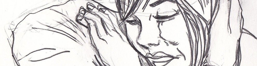
“Hope for the Homeless” was a little trickier. I kept trying to draw pictures of guys wearing ratty beanies with nappy beards looking pitiful. That was a little overt.  Then, I had a revelation. I grabbed the camera phone:

And BAM: hands outstretched, looking like a heart. That quickly became this logo:

And we had our three options designed and ready to go. All that was left was to tie it back into our “Bethlehem Effect” theme. I did that by designing a parent logo from the “Bethlehem Effect” fonts, adding three multi-colored ripples at the suggestion of my friend, David (to show the ripple effect of being generous).

Now we needed to create a set of banners for the program that would hang behind our scale mockup of Bethlehem, acting as the “sky” part of the setup.

After sending the banners off to be ordered, we got our Styrofoam and some electrically heated knives, carved and painted our town, printed up our brochures, and the little display of Bethlehem was born:

And here’s a closer view:

This is the beauty of the job. You start with a logo idea; you end up with a giving campaign housed in an artificial foam city. I love the journey of creativity that my staff is willing to take. Small starts definitely lead to big effects around here.

Leave a comment

Filed under Church, Graphic Design

Storyboards 3: “The Bethlehem Effect” Bumper

From the beginning of our holiday planning, our church staff was talking about making a super-special Christmas video (called a “bumper”) to start our sermons. We were already trying to promote a semi-magical, storybook theme for all of our holiday messaging. So how did that translate into a minute-and-a-half video?

The conversation quickly turned toward animation.

Video wizard Vince and I talked about some initial ideas with our pastor, Steve. They had already picked out some music that they thought captured the feel of the holiday, so we built a video scenario based on that. Then, we took the scenario to a larger video consulting team to work out the kinks. After we felt good about our concept, we sent it out to the senior staff for final approval:

Our homework paid off. Approval was granted, and I started drafting the storyboard. I think it was one of our best yet.

Now all we had to do was put the dang thing together.

Next: The Bumper That Nearly Ate Us Alive

1 Comment

Filed under Church, Storyboards

The Most Wonderful Time of the Year

Since arriving at the church, I’ve consistently been told that Christmas is a pretty big undertaking. (People usually say this with either a wicked smile or a look of pity.)

And it’s truth. Our Creative Arts team kicks into high gear when the holidays arrive, picking out special music, lining up soloists, and bringing on seasonal tech people. We decorate the stage. We decorate the foyer. We throw parties and brunches. We even do a super drumline edition of Little Drummer Boy in our Christmas Eve service.

We also go all out on the holiday messaging. And boy was I excited when my supervisor told me,

“Christmas… is all yours.”

…………………………………………………………………………………………………………………………………………………………………………………………………….

My first job was to sit down with our pastor, Steve Bradley, and pick his brain on what our Christmas theme was going to be. Steve and I are both concept-oriented guys, so I brought in a notepad to catch all of the ideas that we were throwing about.

The big idea behind this year’s Christmas messaging is the ripple effect caused by Jesus’s birth. Like, isn’t it crazy to think that something as big as the Kingdom of God began with such a small birth… and in such an unassuming, backwater town as Bethlehem?

But the only way we knew how to communicate that was by calling it “Christmas Shockwave.” I did a couple of passes with that notion in mind:

We got the colors down on the bottom image (the blues, purples, and whites of a December evening). But “Christmas Shockwave” still sounded too… intense.

That’s when we decided to focus more on the ripple idea. My next pitch to Steve, after consulting with him and our video wizard, Vince, was this:

Closer to the mark! We had started to nail some more things we liked– a magical, storybook feel, old papery textures, and even the title was sounding good.

But looking at it, our music minister had a bright idea:

“I’m kind of thinking that instead of something shining ON Bethlehem, maybe we should have a glow coming OUT of it.”

Well, we could do that:

And approval was passed. After hunting for the right fonts and revamping the background, we arrived at our logo:

Now our official logo for the holiday season, we printed and manipulated this image in all kinds of ways… including making this into our giant billboard at the church entrance on FM 1488. Seeing your stuff in all of its enormous 10  X 20 glory or whatnot is a new kind of thrill.

But we still had more work to do. After all, the season was only just getting started….

Next: We Venture Into Animation

1 Comment

Filed under Church, Graphic Design

Adventures in Branding

We’ve just wrapped up our month-long capital campaign at work, and it’s been a major lesson in communication and identity-generation. When you’re asking people to donate extra money to a non-profit that they already support (in this case, a church), you have to implement a lot of moving pieces to cast the vision… multiple videos (like this one), websites, print pieces, banners, posters… even small ephemera like nametags and rubber wrist bracelets.

But it all centers around a brand… something symbolic that quickly communicates the vision and feel of the project. For our Ask God project, the primary message was that we as a church needed to ask God how we should grow for the future. So there was a major emphasis on requests– both toward the congregation (to give) and to God (for wisdom). And our secondary message was that growing meant building new facilities– a children’s building and a food pantry specifically, along with some renovations to existing buildings.

My supervisor, David, and I both contributed ideas for the campaign logo. Here are some of my efforts:

The Hebraic aspect on this one was probably a little distracting from the project goal.

This was a more illustrative pass. In retrospect, we've got more of a photo-oriented aesthetic around here.

Ultimately, however, David’s vision and experience carried the day (and rightly so). What David successfully did was integrate both elements into his design. You’ll see the request element as well as a subtle hint at the upcoming construction projects. He combined it all with a rugged aesthetic that suggested that we were getting involved in a very hands-on effort. Check it out:

After the logo was approved, we went to work on a lot of those moving pieces. I got to be responsible for projects like the project website, the slide show, and posters that showed the renovation plans. Here’s one of my favorites, using the architectural plans for our property:

Ultimately, we were able to raise enough to get started, enabling us to expand in ways that have been long overdue. It was a good, busy season.

And as soon as it was done, it was time to get started on the equally-busy Christmas season.

Next: Getting Ready for the Holidays.

Leave a comment

Filed under Church, General Musings

Watercolored Worship

I mentioned practicing with watercolors for an outdoor worship event we were gonna’ put on. That happened on Thursday night. And despite some unseasonable cold weather (for Houston, I mean… it never dips below 75 here), it was a great experience.

The concert was divided up into four thematic sections of 2-3 songs apiece, each based on a line from an old hymn called “Spirit Of The Living God.” They were:

Break Me

Mold Me

Fill Me

and Use Me.

As the worship leaders sang, I and my colleague, Judith Dollar, took turns quickly sketching out concepts and images from each song on matboard, then quickly dashing watercolors on before the set ended. It was a challenge, and you can see the speediness in each of the drawings I’m about to post here… but there’s also a fluidity to it that nicely captures the feel of worshiping together, huddled in blankets on a beautiful November evening.

First, my stuff:

This is from the Break Me set, with songs including “Come Thou Fount,” “Word of God Speak,” and “Restless.” I tried to put in our Creative Arts pastor and our mandolin player, along with some outright ventrical symbolism. I muffed a Hebrew symbol though. Anyone find it?

Judith was up next. Here’s her work from Mold Me. The first depicted “Like A Child” (by Jars of Clay) and “Beautiful Things (by Gungor)…

…and this depicted “Waiting Here For You” (by Christy Nockels… I think.)

You can see that Judith’s got this watercolor thing down. She used these special crayons to fill in space quickly, then went back over them with a giant wet brush to spread out the tones. I tried to emulate that on the The Fill Me set.

Songs here included “Captivate Us”… and I forget the other. I DID try to weave in elements from Jon Foreman’s “Baptize My Mind,” though.

Finally, Judith stepped back in with a bold piece for the Use Me set.

This exclusively concerned “Take My Life (And Let It Be)” which Chris Tomlin made popular a few years back. Note the strong color surrounding the guy on the right, with the heart exposed prominently in the middle. Almost like an aura’s coming off of him. Very cool.

Using watercolors is a fun, messy process, and if you keep at it, you can get some beautiful results (there’s a metaphor in there somewhere). If this stuff piques your interest, Judith also participates in a group that does live drawing/watercoloring on a regular basis. They’re called Urban Sketchers and they’re very cool. They also have a Texas-only branch, which you can check out here.

1 Comment

Filed under Church, Sketchbook