Last week, we were talking in staff meeting about why people come to StoneBridge (the church I work at). After we sorted through a few deep, spiritual concerns, someone mentioned our sermon logos.
See, we have a large billboard at the church entrance, and we put our new sermon branding on it each time we start a new series. It was mentioned that folks have come to church here just because my predecessor’s signs piqued their interest. Then all eyes in the room turned to look at me…
…Aaaand I’m only four weeks into being the main graphics guy. No pressure.
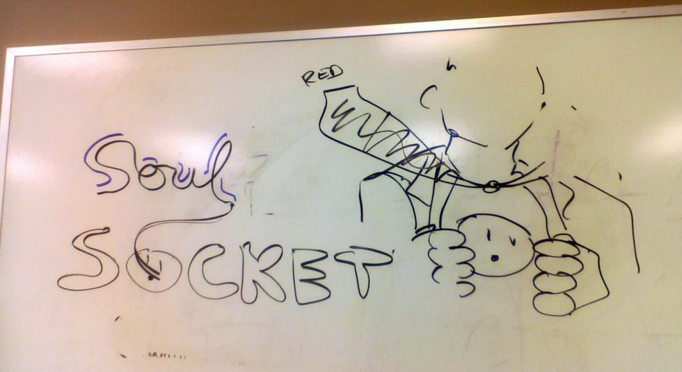
Fortunately, we’ve got a good process in place for these things. Here’s how we got there on our most recent logo:
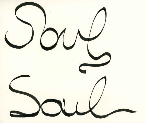
This was pretty simple and readable from a distance, but it also required a little bit of a longer look to get the whole meaning (and we love forcing a second look at our material).
I think we delivered.


